Travel Journal: Paris

I will try my best to write a single sentence that summarizes how I feel about Paris having visited it for the first time last week. It doesn't feel over-the-top to just say this: this city is its own gift to the world topped with a giant, ridiculous, glittery gold bow. W0W. I’m just stunned. My sister Paris and I spent the week taking bikes around and giggling at the Parisian sidewalk pups between stops at the Paul bakery for the only baguette I’ll ever need to eat again. How DO they DO it? It feels like dreaming in shades of gold— or rather that every object is drenched in gold leaf. Cheeeesy cheesy yeah yeah yeah, but true. Please scroll for my attempt to do Paris a single bit of justice in photos :-)

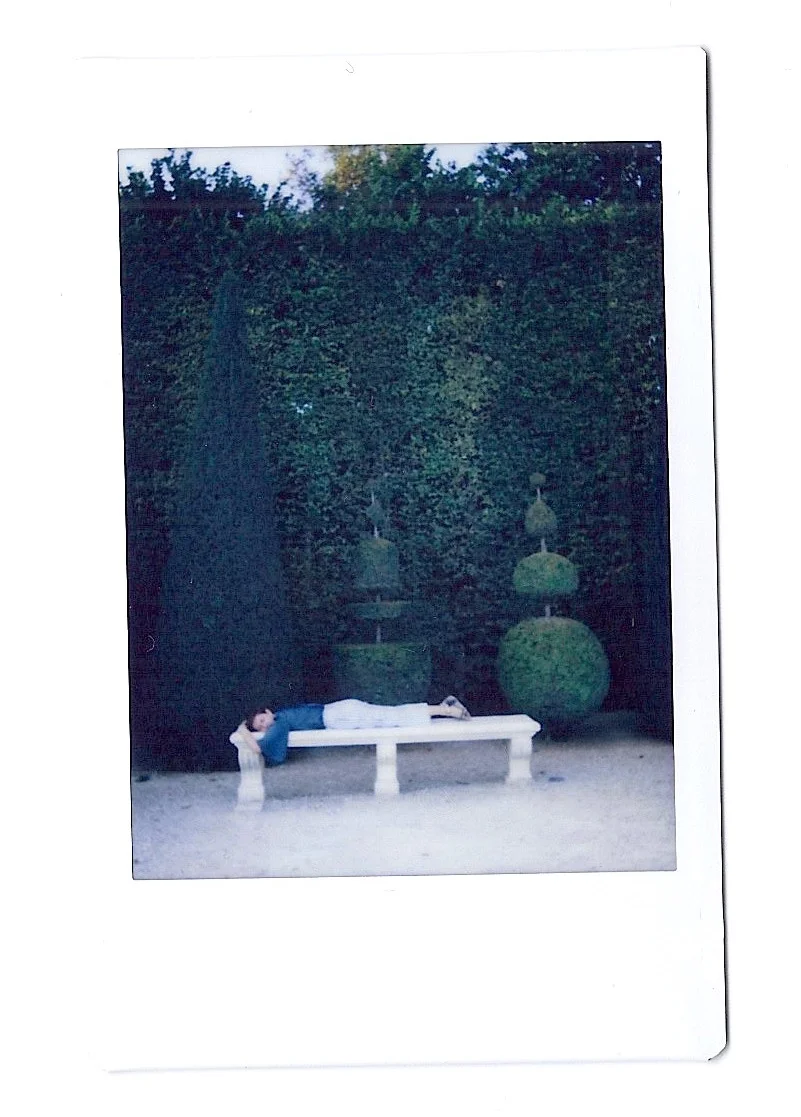
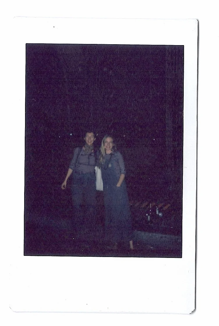
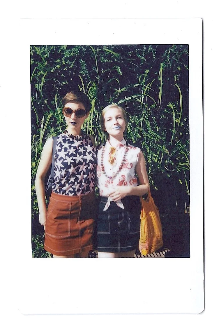
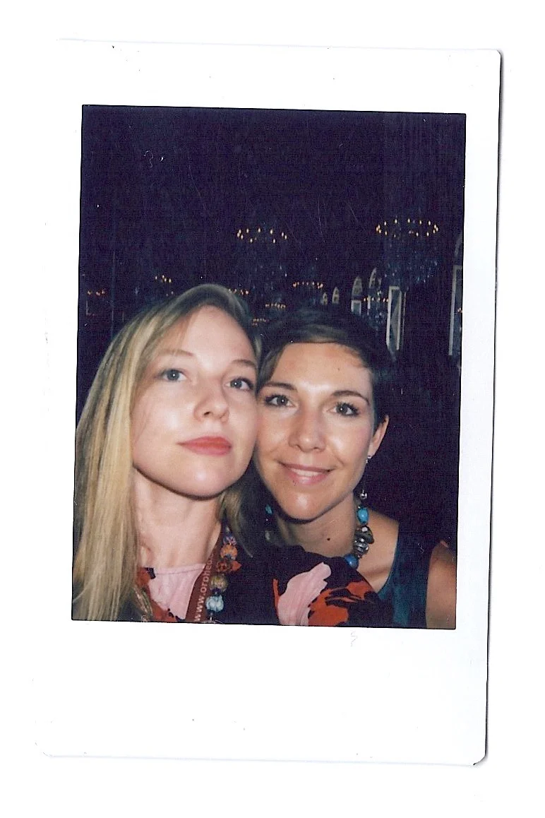
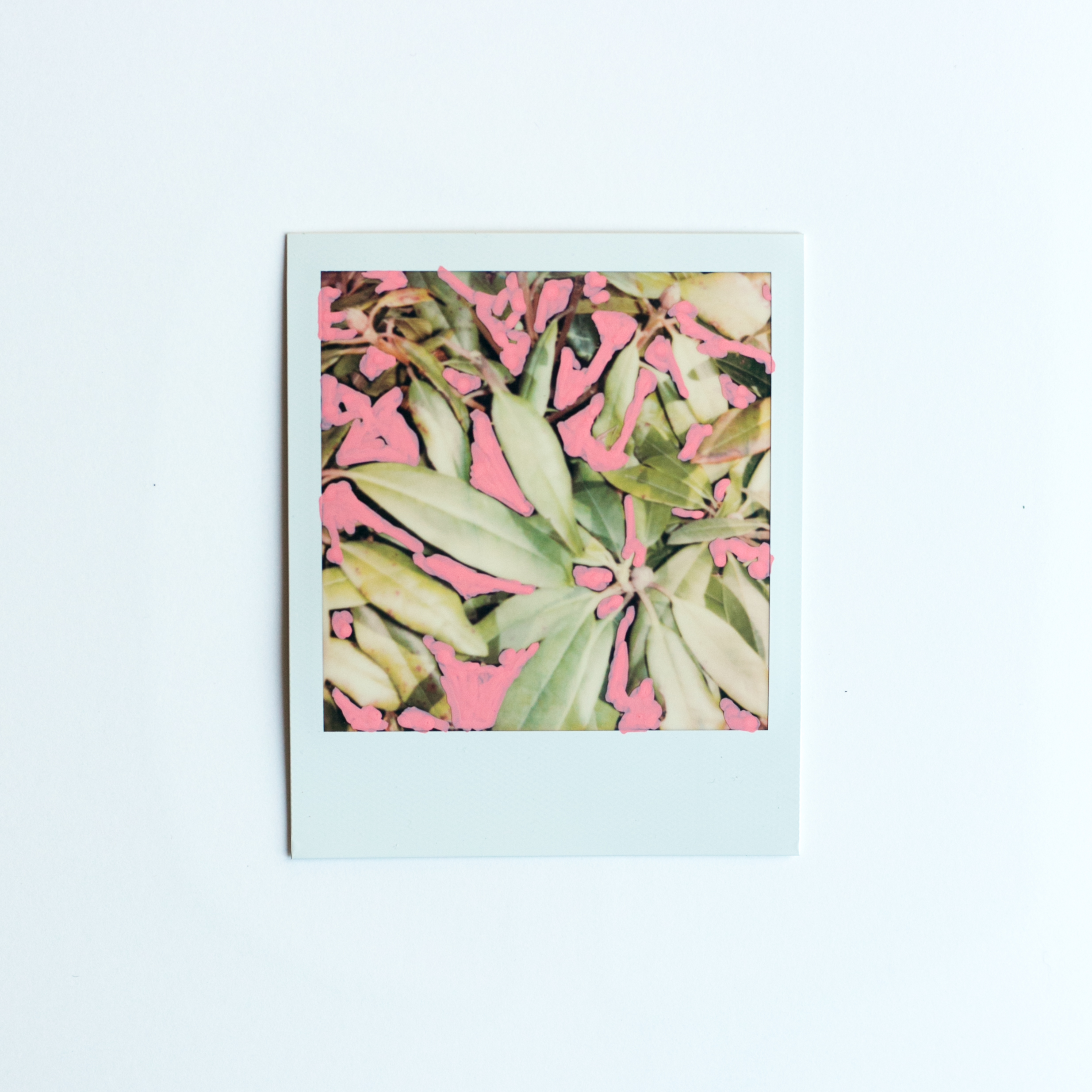
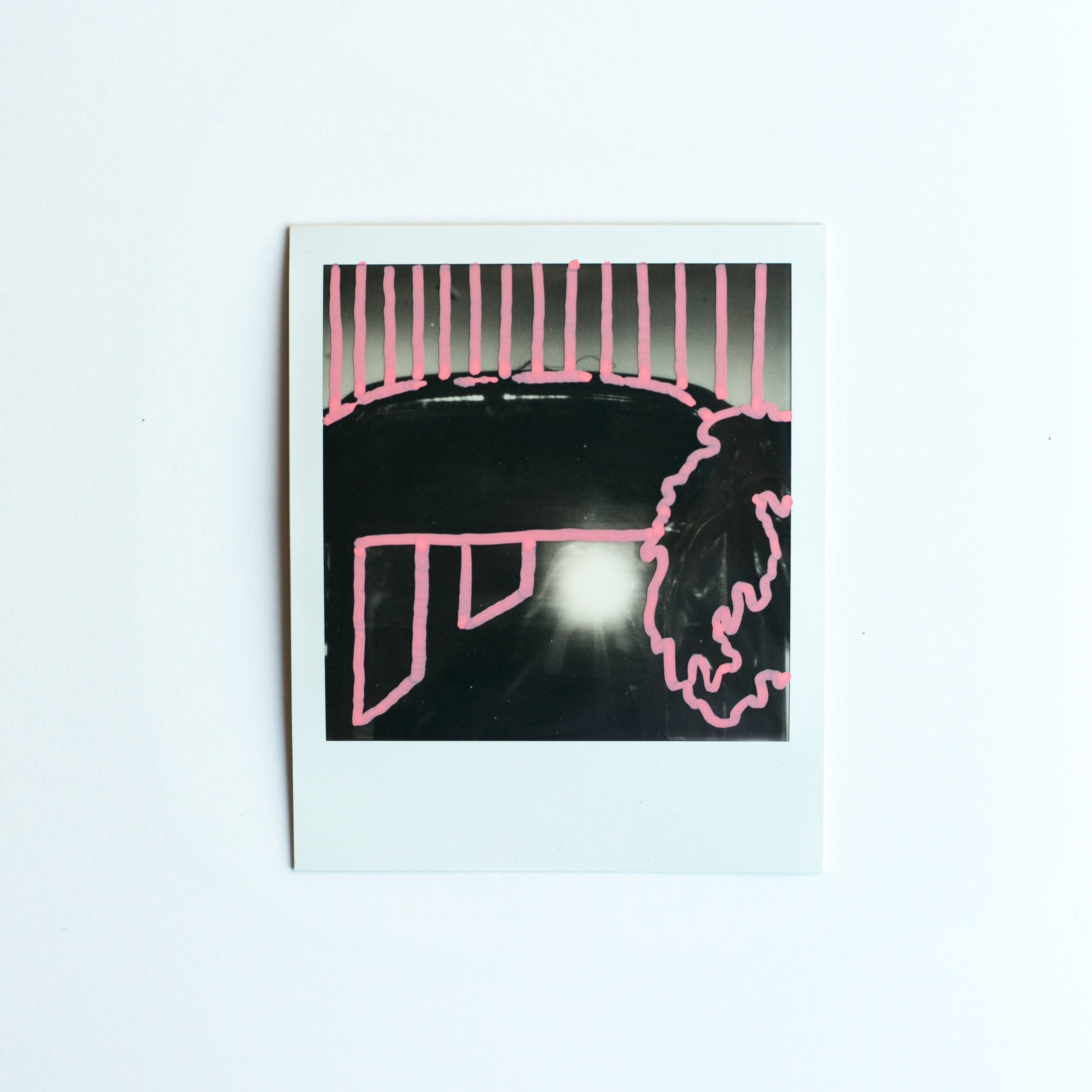
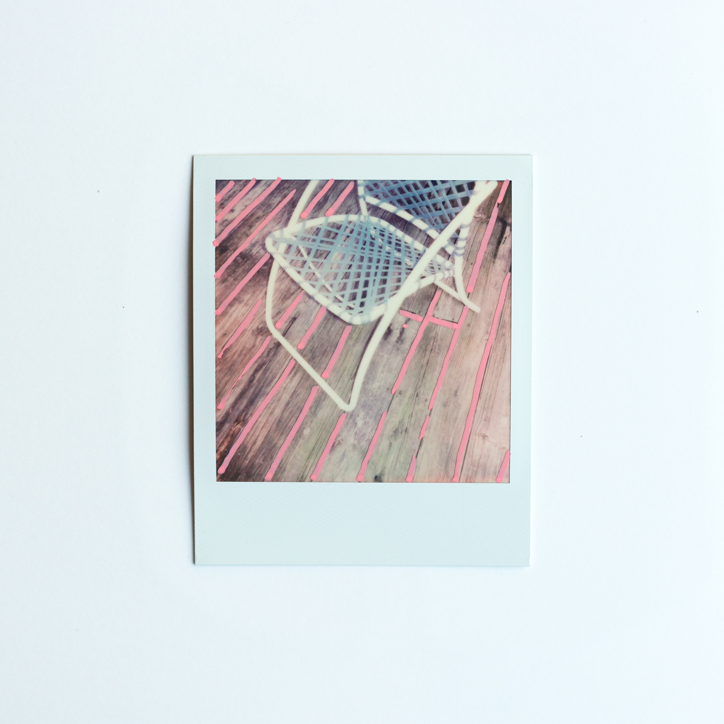
These are some of our favorite sister-mems from Versailles and Fontainebleau. I focused most of my energy on filling up my sketchbooks, so I didn't actually take my camera with me as often as I'd usually while traveling. We caved and bought a Fujifilm Instax camera for an extra level of sister adventure documentation, though. It's here that we reveal *with zero shame* our new love for matching clothes. Is it obvious that we get a kick out of being sisters? Now we just need Sister #3 to come join us to complete the set :-) 

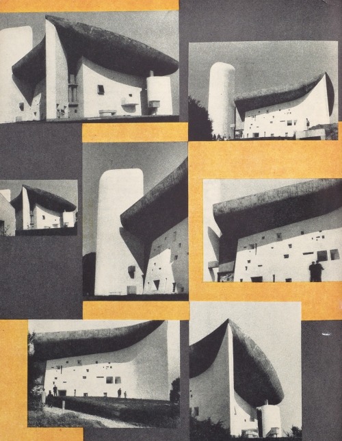
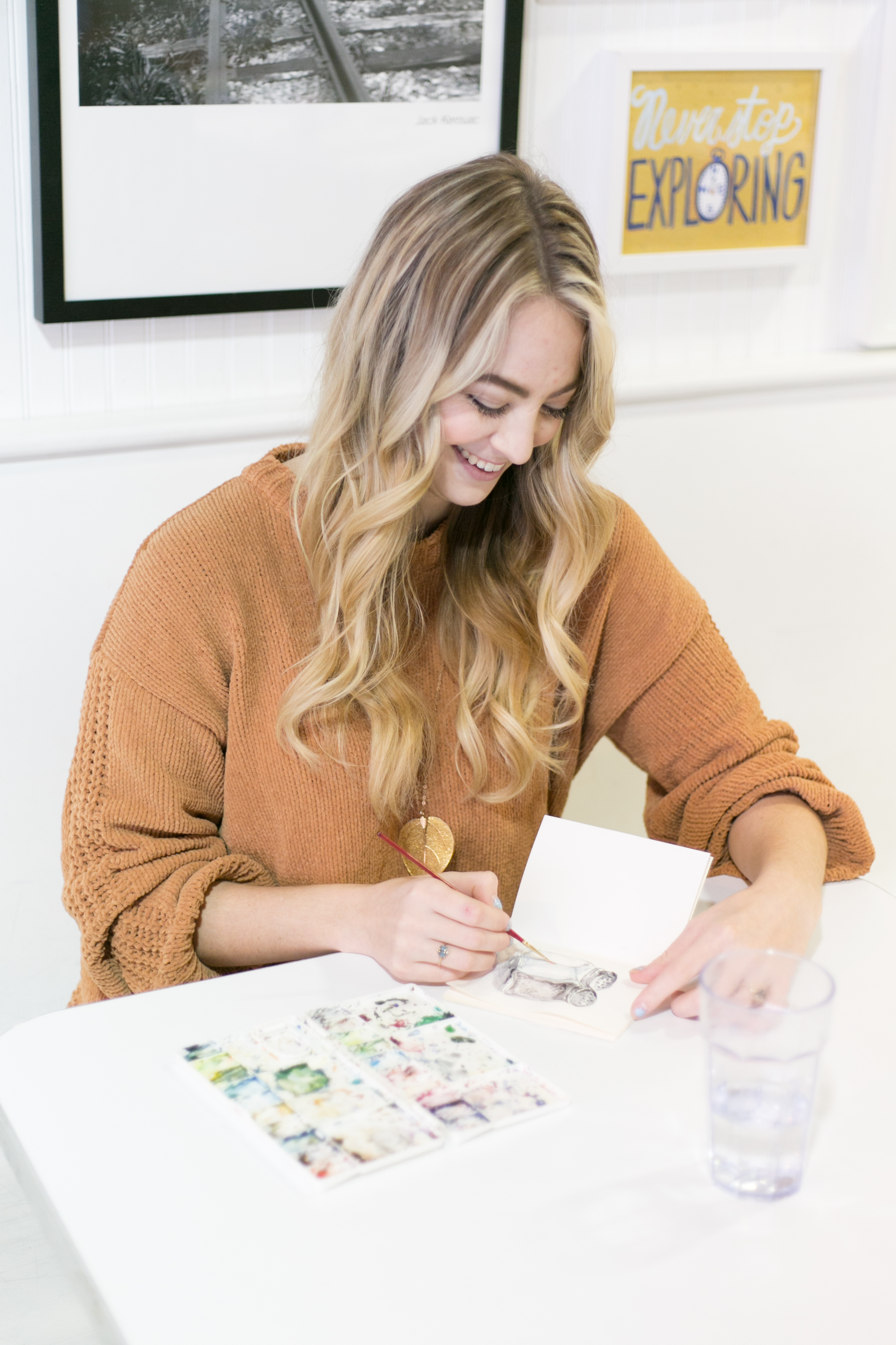
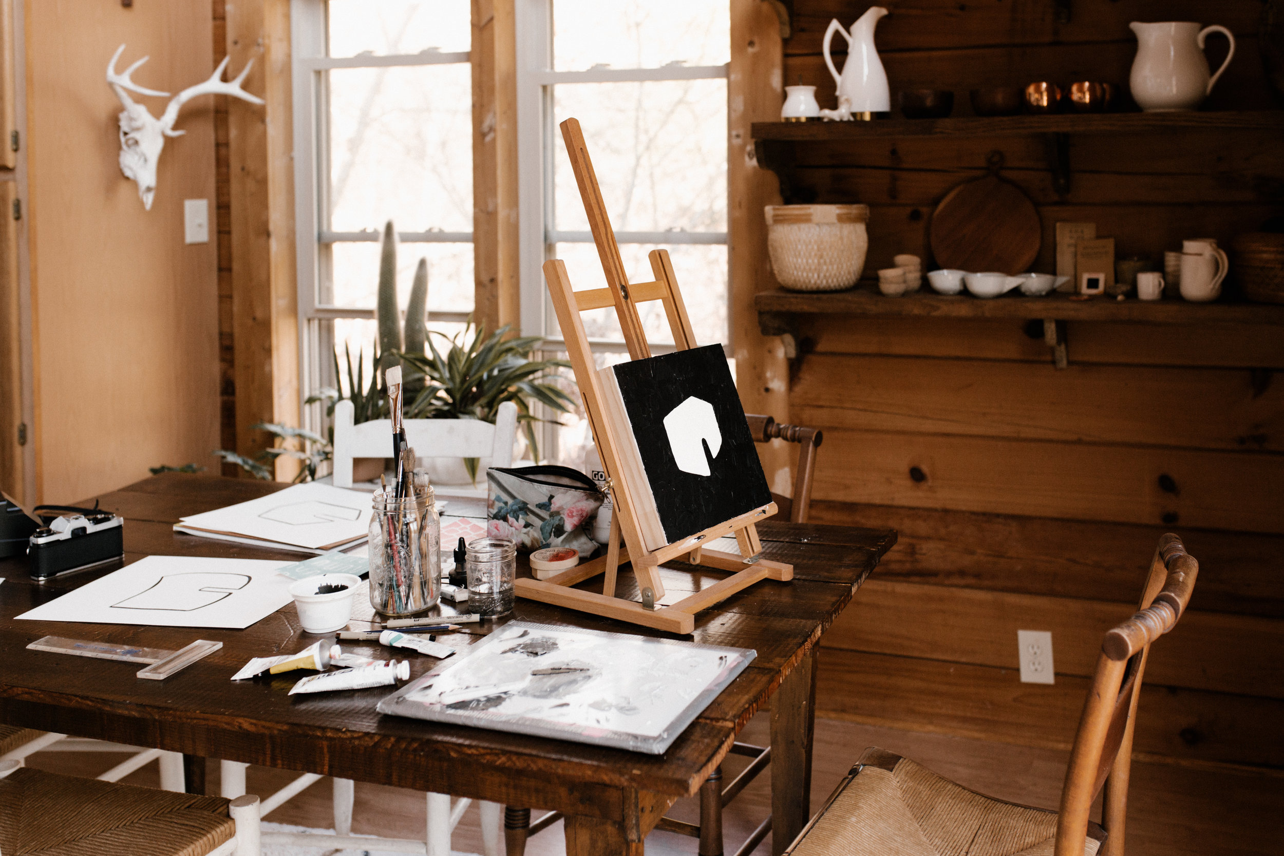
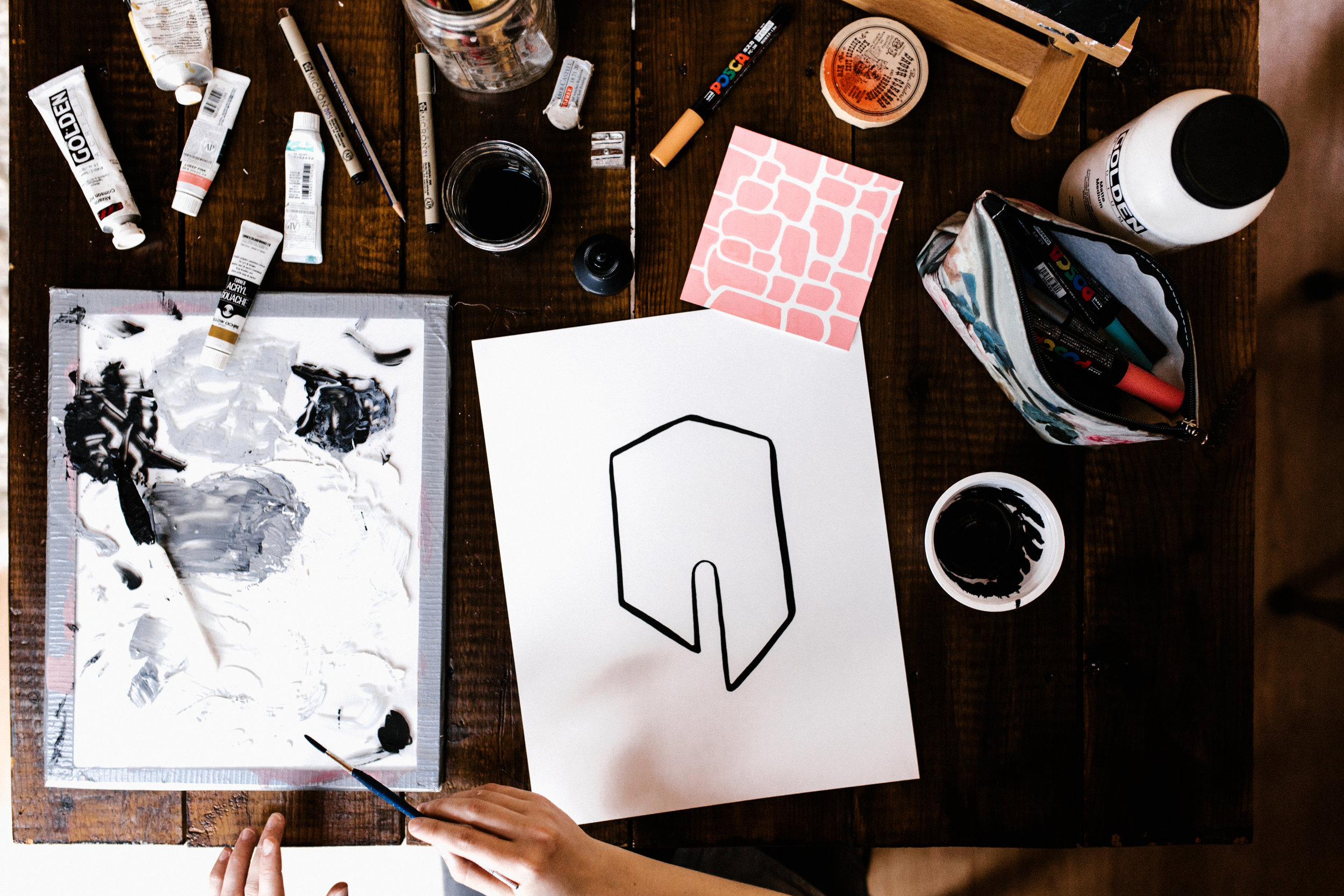
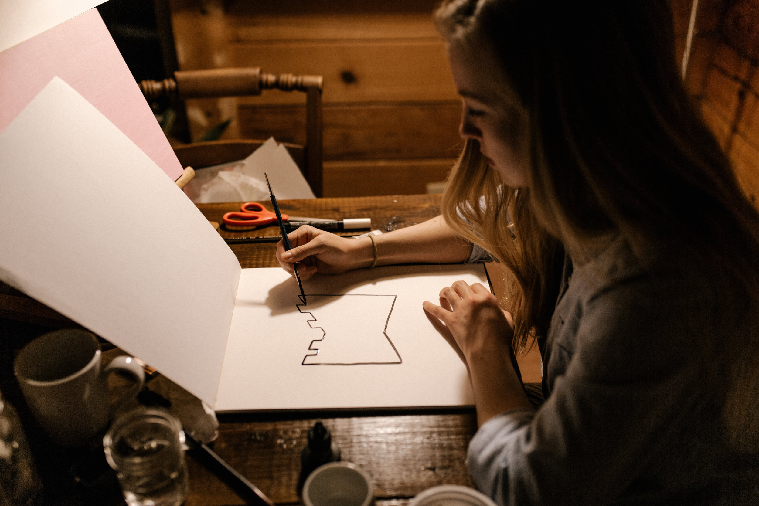
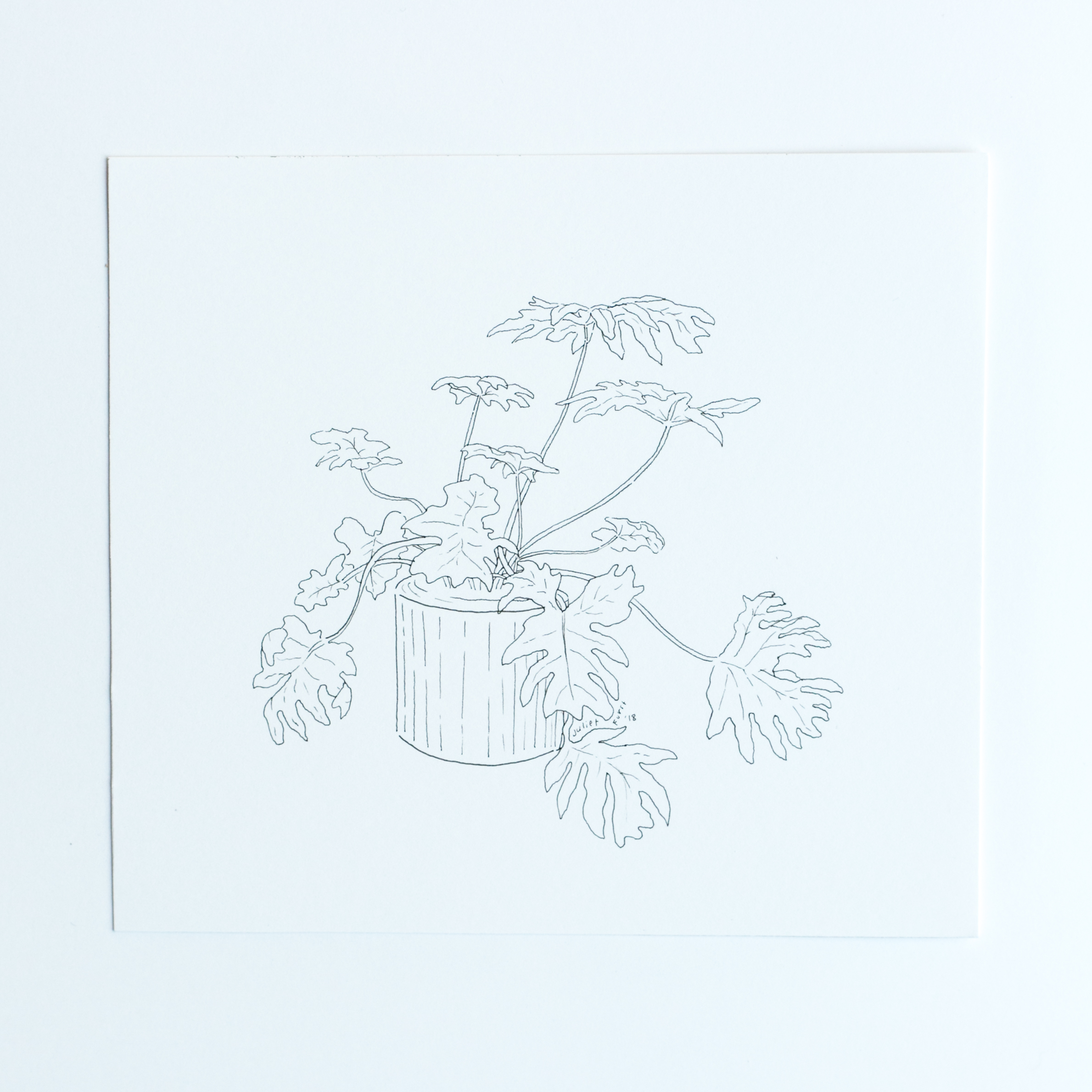
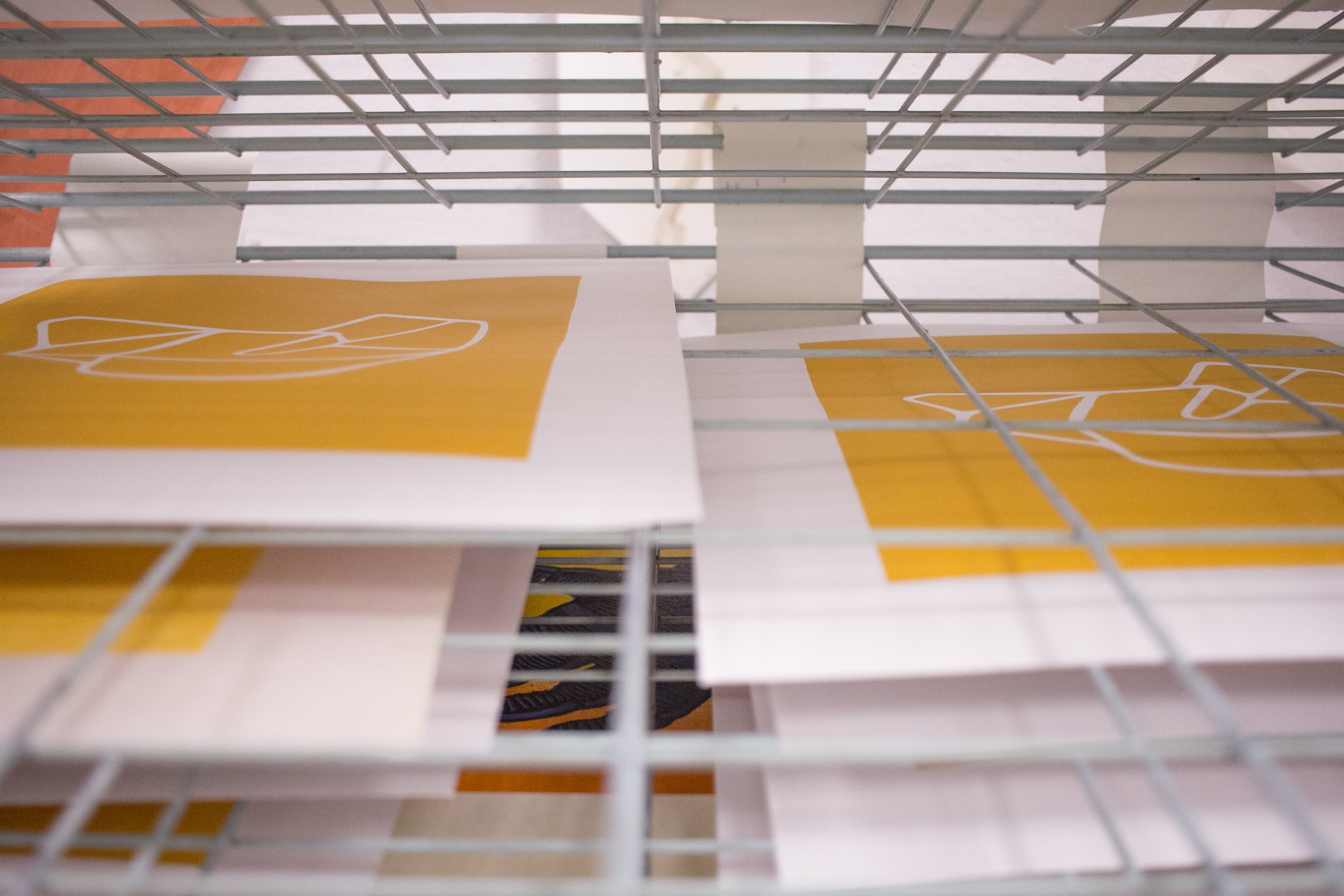
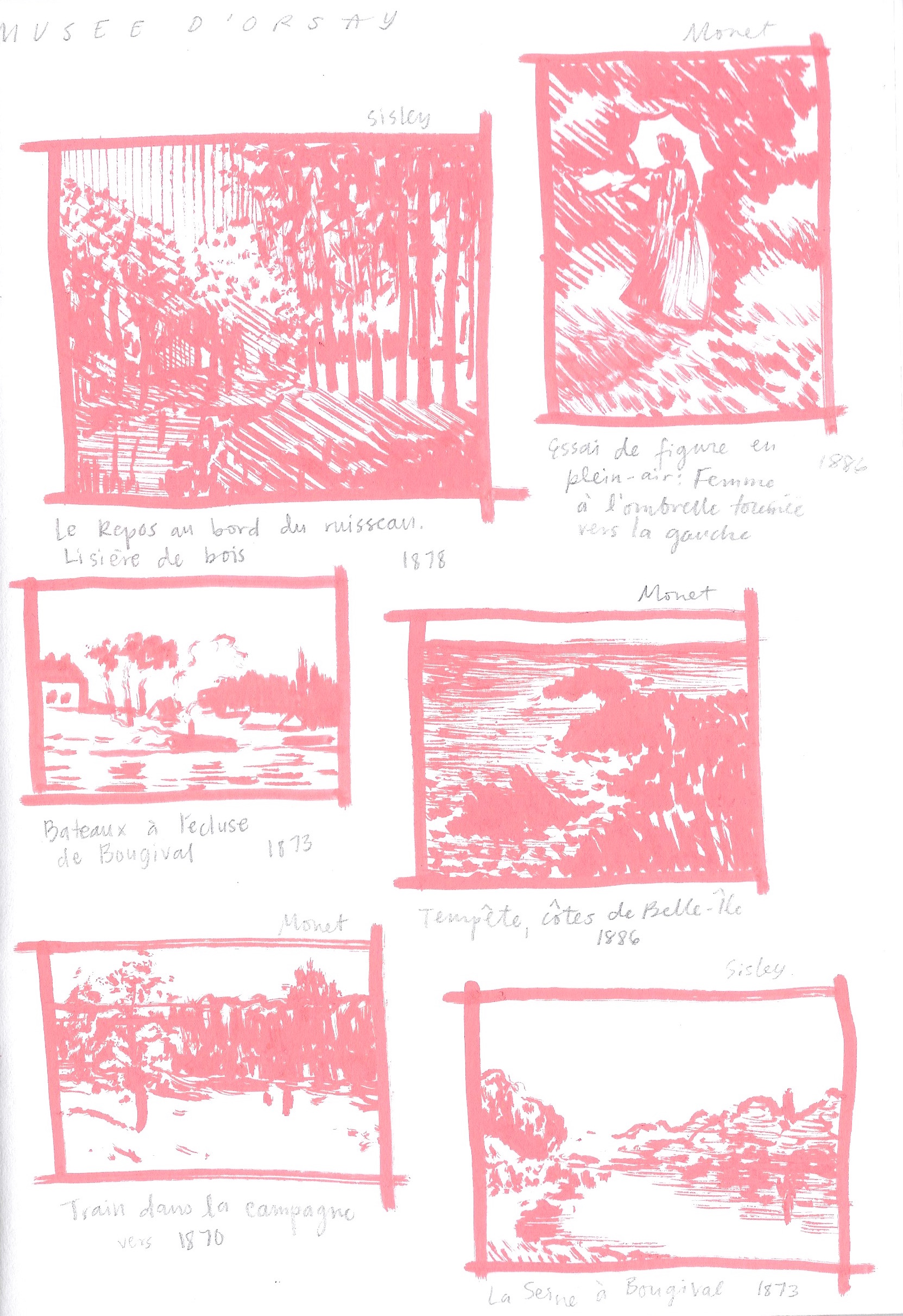
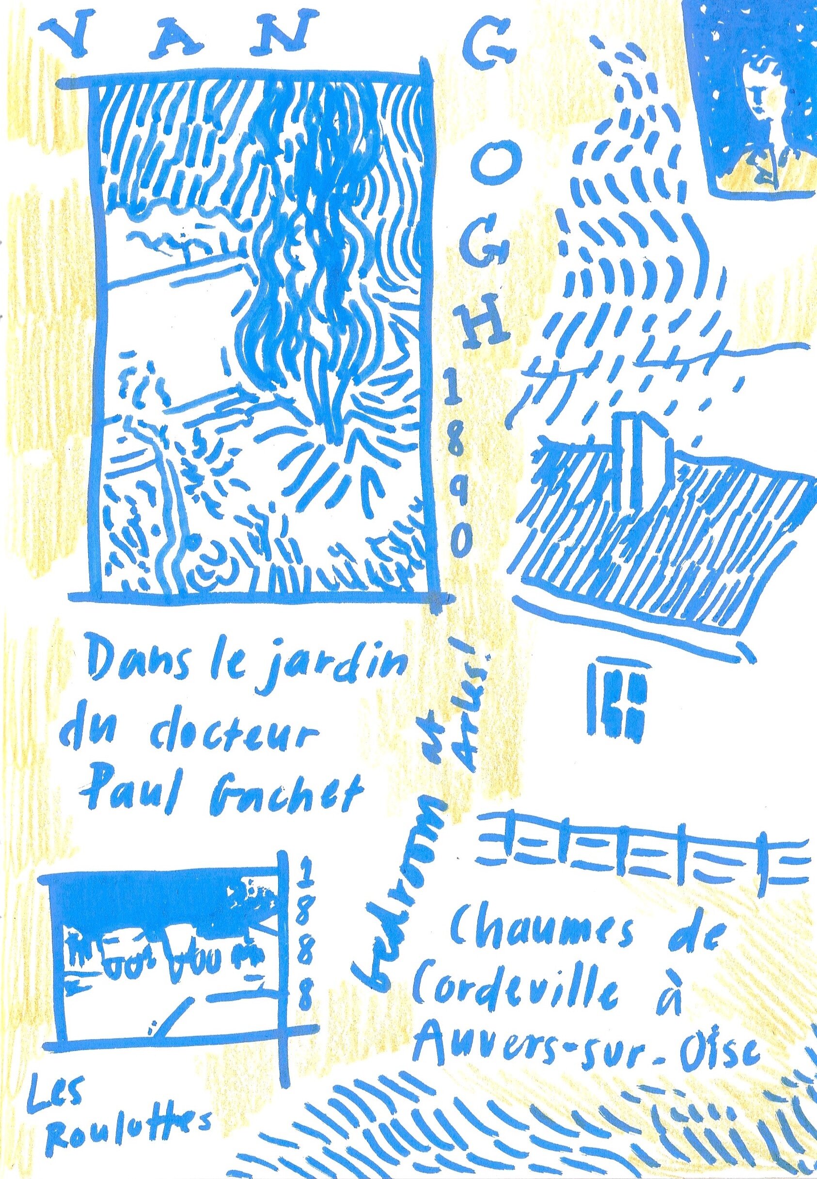
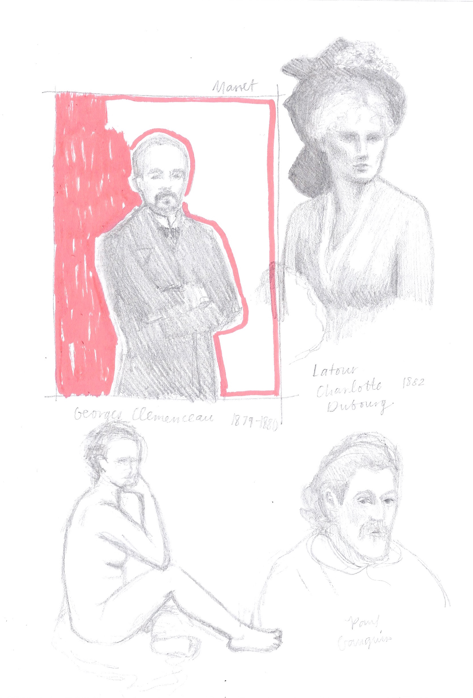
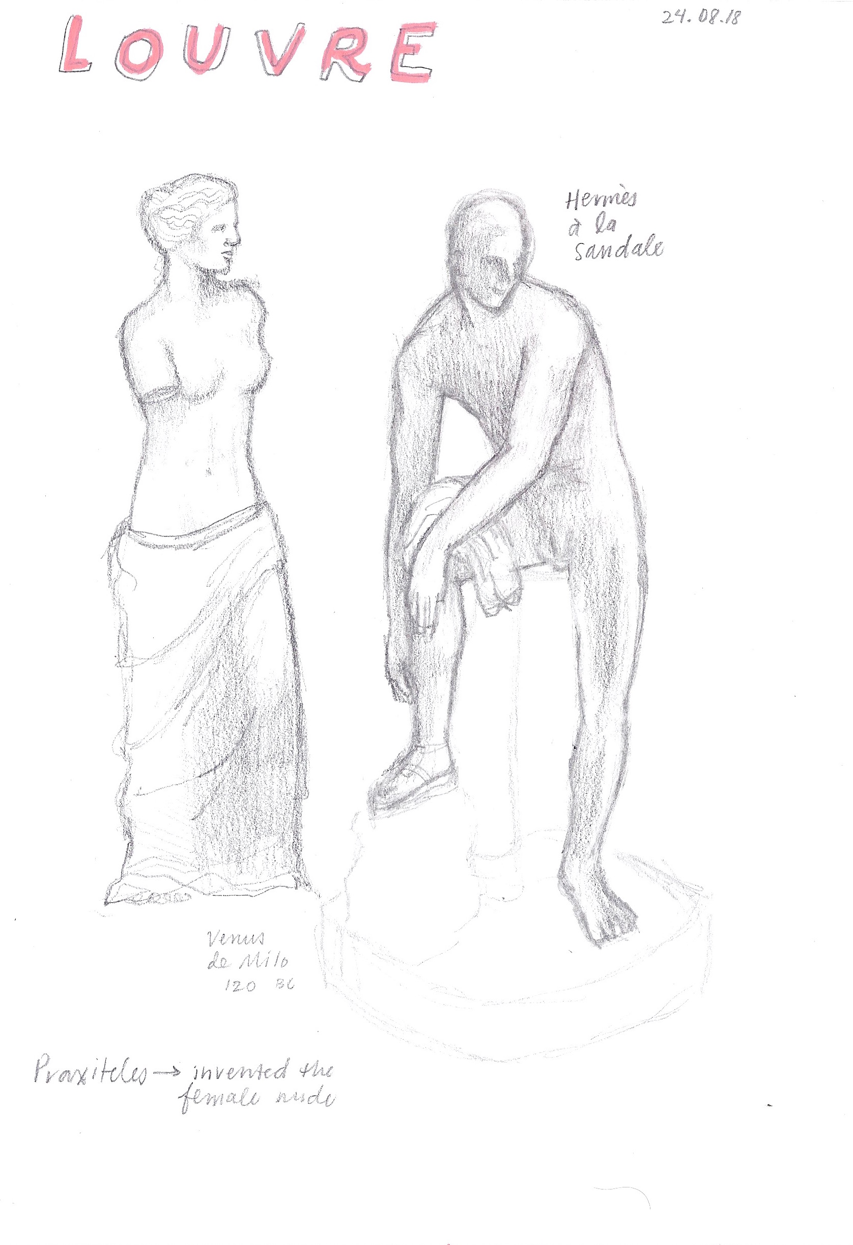
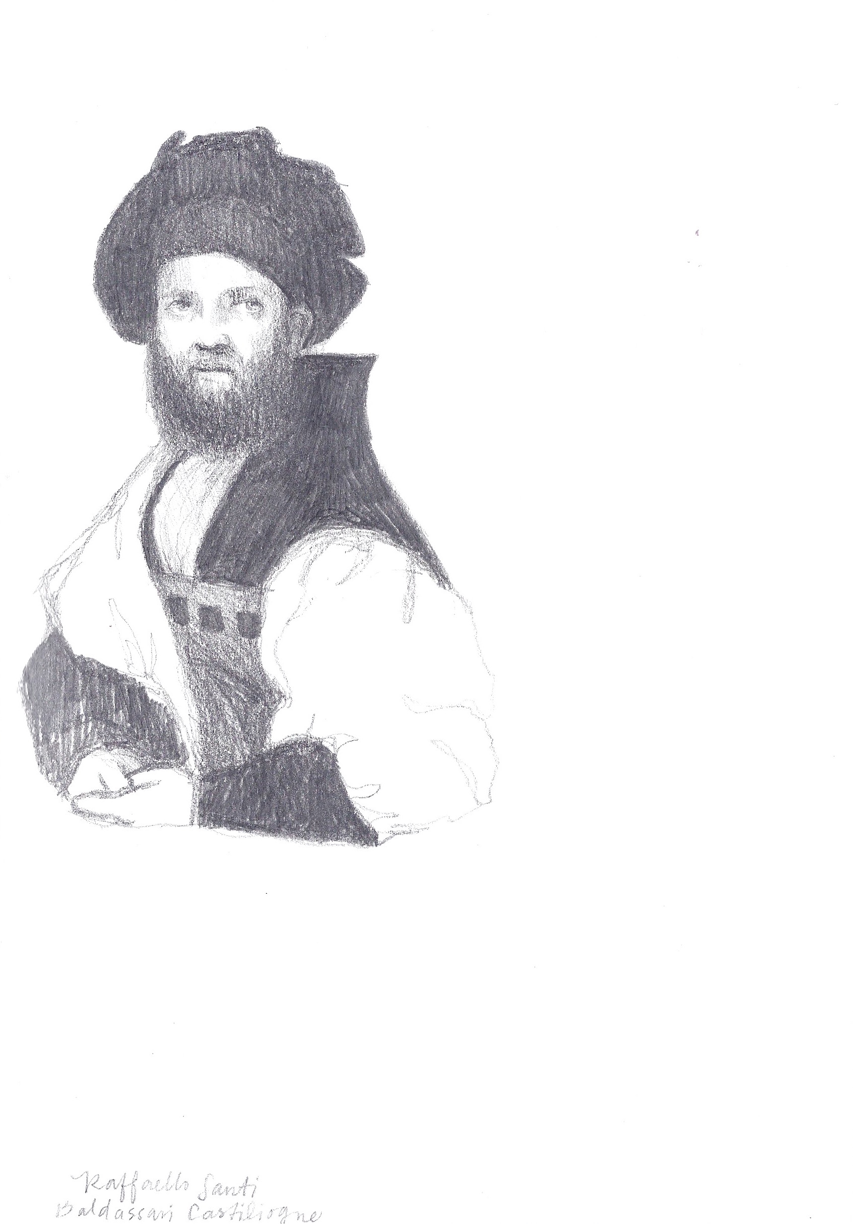
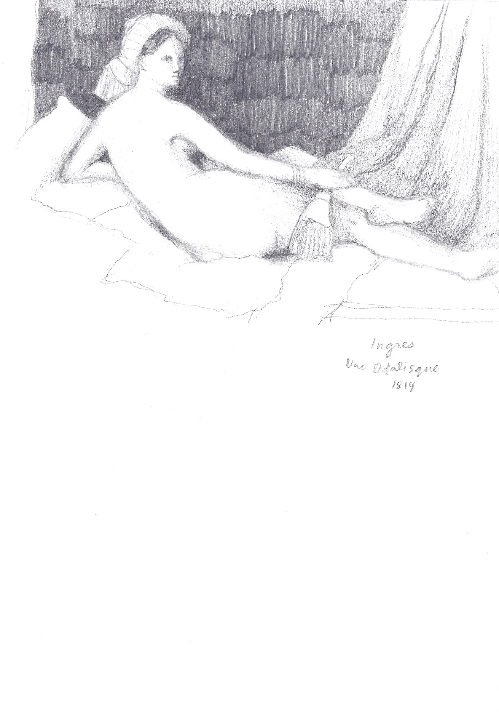
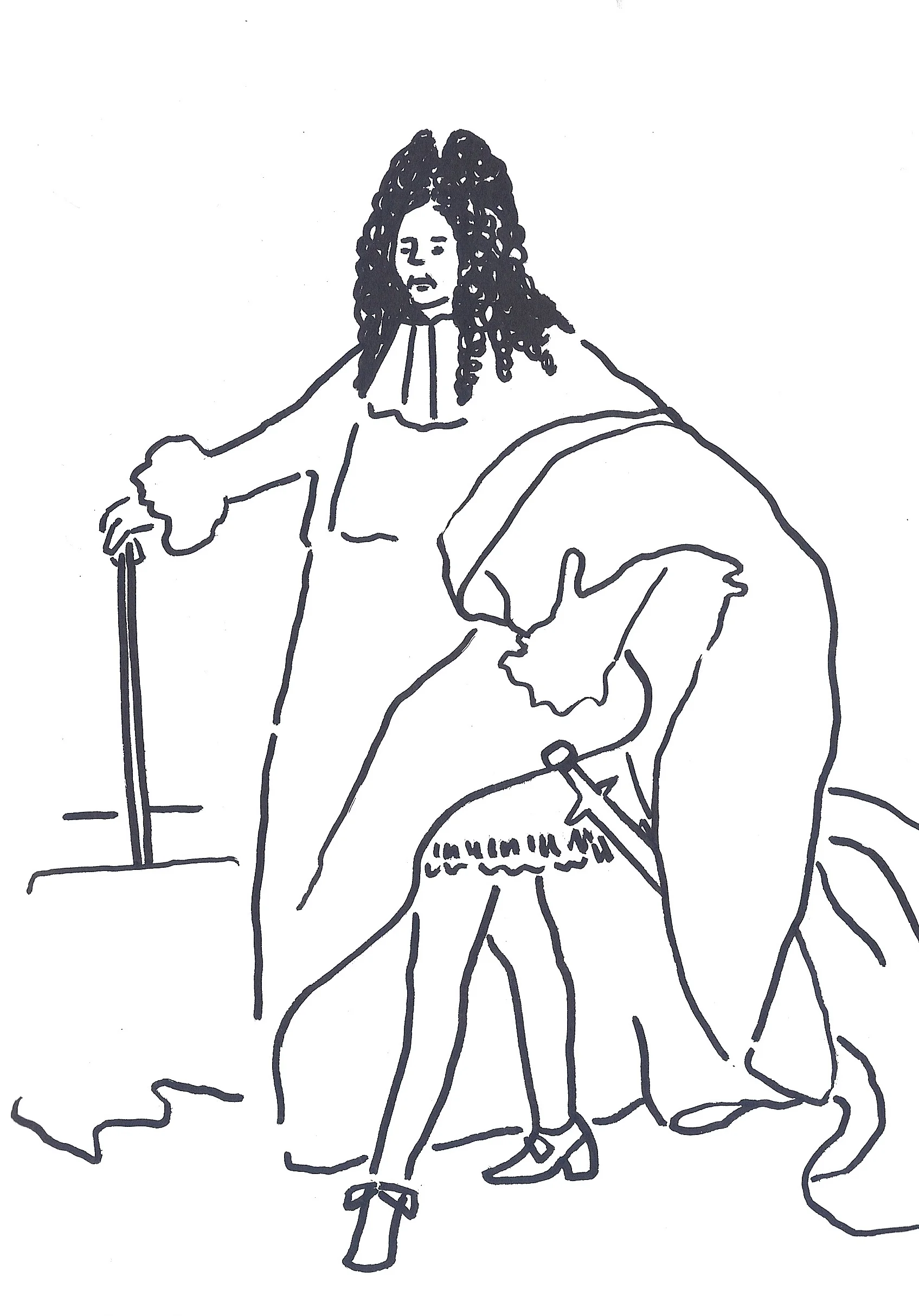
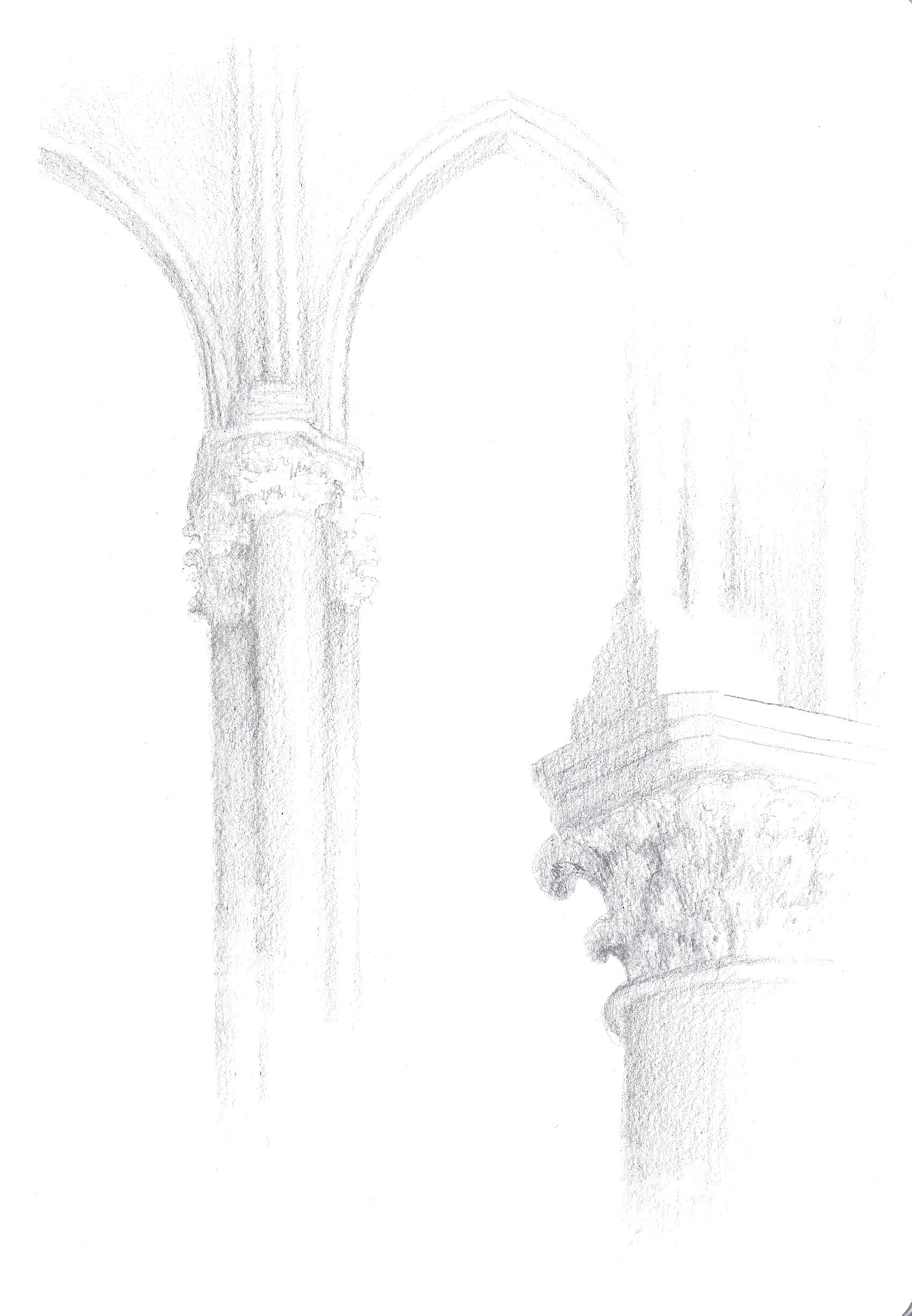
Here are a few of my favorite sketchbook pages from the week. These are split between the Musee D’Orsay, the Louvre, and the Notre Dame. I had a BALL at the Pompidou, but I only gave myself two hours there, so my sketches are a bit more rushed (read: frantic and scribbled) as I was mostly just jotting down ideas and names of favorite pieces.

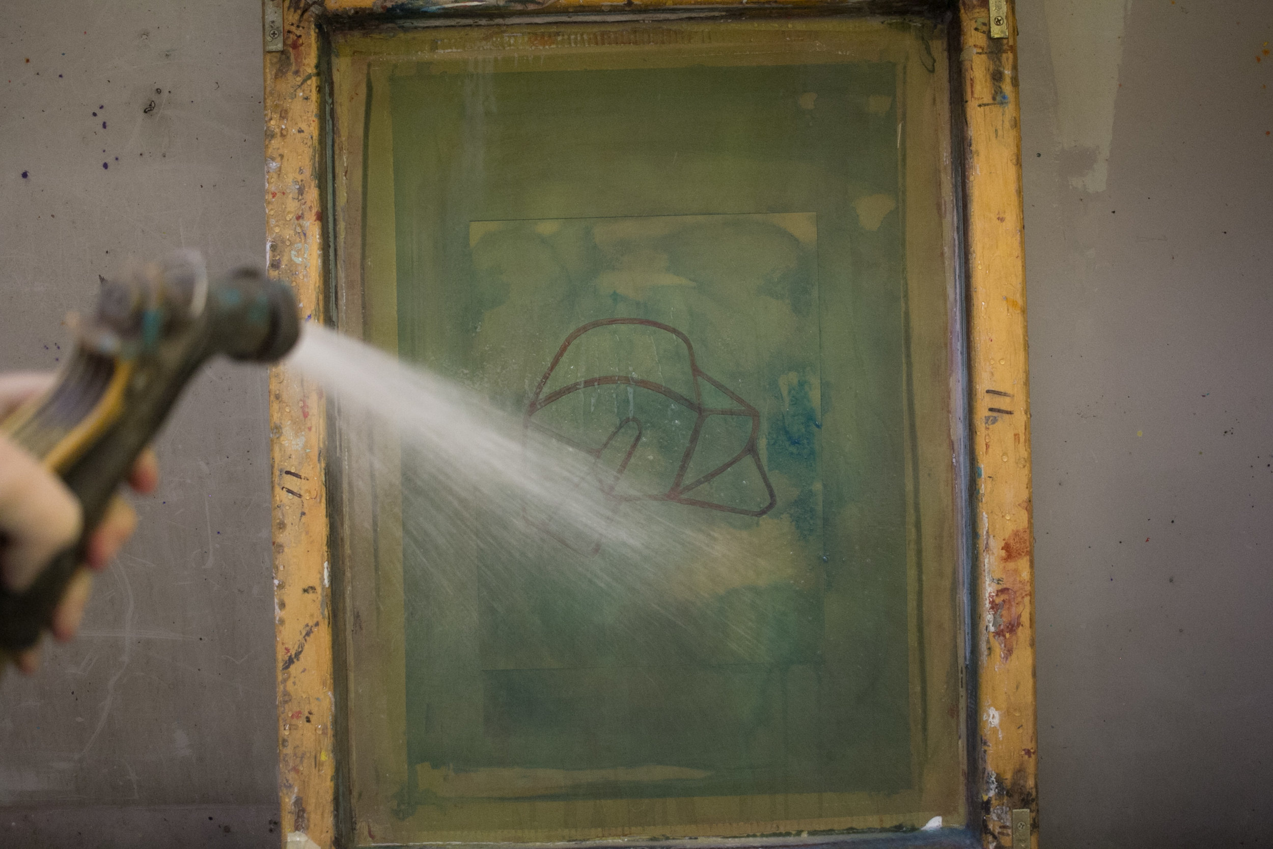
As far as materials, I used my gouache paints a little but mostly stuck with my Posca pens and pencils as they’re perfectly pocket-stowable for long museum days. I’ve been trying out Hahnemühle’s A5 watercolor sketchbook for gouache and I looove it. Otherwise, for museum sketches I stuck with a simple A5 size Daler & Rowney sketchbook

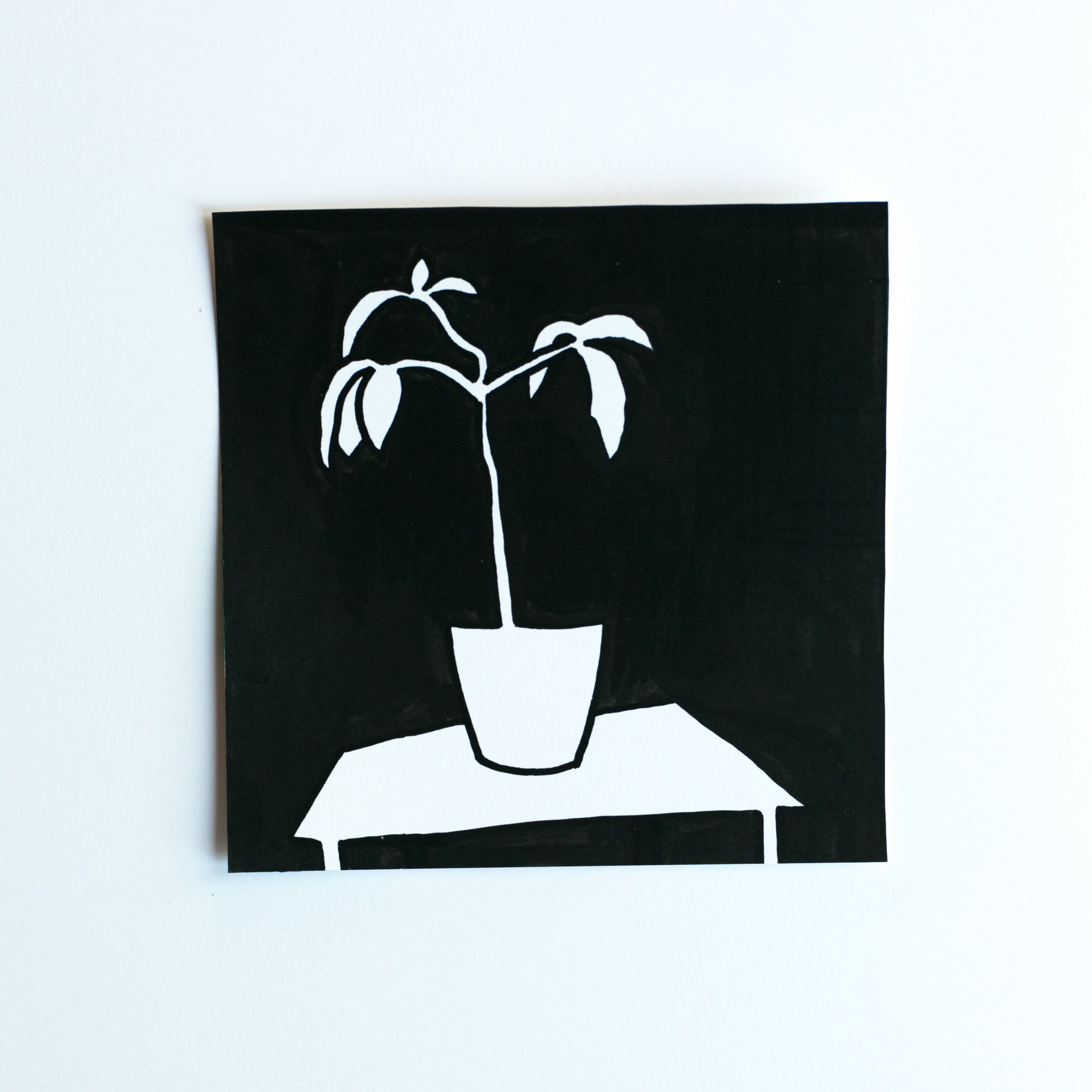
I had a good little time giving myself tasks, like trying to copy down all of my favorite things from the Van Gogh rooms using only my blue Posca pen, or trying to replicate the highlights and shadows of the impressionist landscapes using only pink. I saved the juicy graphite sketching sessions for the oil portraits and the Greek and Roman wings of the Louvre.

Had. a. blast. I’m one of probably several thousand visitors per day who walk out the doors saying, “ I HAVE TO COME BACK AND DO ANOTHER WEEK IN THESE MUSEUMS.” Really, though- they’re so dense. I didn’t bother trying to see even 80% of them, and instead moved at a pace that allowed my eyeballs some time to take it all in. Was well worth it.

k y’all, au revoir! I’m not gr8 at blogging, so I’m going to end this without a proper closing sentence. Unless this counts ? Alright cool

Inspiration Roundup I

Was so close to referencing Woody's Roundup in the title, but didn't. (so I did it here). Yee haw

I thought it might be cool to start posting some of my favorite inspiration images from Tumblr, a site I use at least once a week to keep my brain fresh & sharp & full-to-the-brim of visual snackz :-) I post these to an inspiration blog that you can take a look at here

SOME FAVORITE BLOGS:

Pretty Colors: exactly what it sounds like---just a bunch of nice color swatches.

calm in trees: an awesome assortment, esp. the delightfully grainy film photos of 1960s and 70s Polynesian palms and surf town scenes

German Post-War Modern: all the boxy Brutalist buildinz you could wish for. black & white film

No Brash Festivity: Modern masterpieces for art history geeks. plenty of brushy strokes and bold colors to go around here

painted out: more photos of art and sculpture, but with a more subdued neutral palette. mostly greys, beiges, and whites

Lookbook: Hand-Painted Denim Jackets

Finally got a minute to edit this shoot, and boiiiii am I excited to be sharing it. I've been thinking about painting on jean jackets for a good little while, and finally found the perfect one to test out. My roommate Hannah heard about this idea and without hesitation handed me her black jacket to paint on. (Bless friends who trust you with paint and their clothes---she's a keeper). I snapped some photos of Hannah in the finished product (which actually was meant to cover the whole jacket until I ran out of time, oopz). She killed this shoot, if you can't tell. I'm also feeling like my portrait-taking practice is getting stronger after several years of some neglect (in favor of shooting architecture and lines, shadows- can u blame me tho? they're just so fun). 

This was also my first time styling a shoot (read: running around Hannah's room and picking up articles of clothing that looked cute and stuffing them in a bag and flying out the door). The yellow pants and the blue sky and this AMAZING punch-hooked clutch just jive so well for me. Give me a blank blue sky aaaany day, but especially with some crazy colors and zig zags. Yis.

I'm vury tired and have another workshop tomorrow ("stitch and poke" embroidery as part of a slow fashion festival here. I love it) so that concludes this post. Keep your peepers peeled in the coming weeks (*months) for MORE JACKETS LIKE THESE that you can have shipped straight to your door! Yeehaw!!

Collab: Daniel White

For the second Greensboro artist collaboration, I sat down with my buddy Daniel White at the beloved Green Bean Coffee and threw some funky patterns (read: disturbed the *visual* peace) on his black and white beach landscapes. Daniel is a Greensboro based portrait photographer and podcast-master behind the Free Pizza Podcast. He's become a GSO legend and I'm so honored to count him as one of my friends.

You can see some more of his work here on his site: Daniel White Photo and Instagram

PS---We're making prints of these soon + will list them as soon as they're available!  

DANIEL WHITE.jpg

Evangeline Furst

One of my favorite emerging artists also happens to be my best friend and little sister, eighteen year-old Evangeline Grace Furst. She is the first in our family to delve into the world of 3D art-making. Evangeline originally got her start in the arts as an actress in a Wilmington, NC theatre troupe for individuals with disabilities. She's more recently been trying her hand at ceramics, and has found a real knack and joy for it. My favorite pieces of hers are the two below from a new series of fired and glazed angular pots with asymmetrical walls. Her hand is so evident in these, as is her eye for muted pastels. I'm! ob! sessed!

We also took her first artist portraits in our parents' studio. The dry and serious "I take pride in my craft" expression was not prompted! Evangeline will be making some more of these, so if you're interested in purchasing (or commissions!), hop on over to the contact page. 

To learn more about Evangeline's story and others' in the global Down syndrome community, head to the T21 Project at www.T21Project.org.

Julian Price Showhouse Bathroom Painting

The Julian Price Showhouse in Greensboro just wrapped up its last public viewing days, and boooy was it a beauty. Below is the gorgeous guest bedroom that my amazing bosses Laura and Gina at Vivid Interiors designed with the help of my coworker Natalie.

This project actually summarizes pretty well what the creative strategist role means at a business like Vivid. It's a lot of the behind-the-scenes details that don't necessarily involve the actual design of a space. After my bosses took care of the expert interior details: selecting window treatments, furniture, wall coverings, light fixtures, etc, I helped create the watercolor rendering of our proposed space, sketched up and painted the bathroom painting, and when each floral arrangement's leaf was finally nudged just so, photographed our room alongside fellow photo nerd Evan Brearey. Below are some of mine from our shoot day.

For the bathroom, we'd initially had it painted this muted green to match the tile, but Laura and Gina thought a bold Kelly Wearstler-inspired pattern would match the funky vibes we were aiming for. With a half-inch paintbrush in hand, several large cups of coffee and a couple days on a ladder, I got these gold guys up on the wall(s). It took longer than I expected, but coating each of these lines thick enough to ensure a rich metallic sheen proved worthwhile. 

juliet furst julian price house

Durham Day Date + Sketchbook

My dear friend Jamie and I planned a little day trip to a super cool North Carolina city that's quickly growing in hip-ness and population: Durham! Jamie relocated there a few months ago and is killin' it as a graphic designer and illustrator. I'm so amazed by Jamie's talent, but even more by her kind spirit and heart for people. She is just the best. You can take a look at her work on her website and Instagram. We took our sketchbooks around the city, coming up with our own illustrative interpretations of random lil' things- salt and pepper shakers at Parker & Otis and coffee cups at Cocoa & Cinnamon, flowers at Duke Gardens, etc. etc. I brought my Posca paint pens and Jamie brought her watercolors and that was sufficient for a day of memory-makin. Perfect! Scroll down for some inspo-foo.

So yes- there is plennnnnty of inspiration to be found around the Bull City- we found it downtown in the 21C Museum Hotel, in the teeny cafes we visited, and even from the funky lil orange and white and yellow and black koi fish at the Duke Gardens. Some photos of those guys are below. And these plants had this overcast-day moody glow (not really a glow- actually the opposite of one, but yknow) that did a number on ma' heart. Look at how pretty they are! We then sat down for dinner at this AMAZING Chinese restaurant where, much to my delight, I was served up some more INSPO with my spring rolls. Since I only ordered an appetizer (if you know, you know) I can't actually speak for the food much, but the DECOR Y'ALL! All you need to see are these turquoise tables with matching blinds. Some may say "Juliet! That turquoise is straight outta the 80s!" but I say, "I didn't live then so I dig it." At my parents' house we had turquoise and peach tile for a while, though, which I'll admit was pretty dated-looking. Something about seeing patterned blinds for the first time made me feel justified in loving this vibe here. I say it's a winner :-)


Collab: Angie the Rose

Yesterday was day two of my Greensboro artist collaborations, and lemme tell you- we had a BALL. If you can't tell, Angie has a super dreamy studio space that served up enough inspiration for the whole afternoon. We opened the windows, drank our coffee, chitted and chatted (does that work? maybe?), and just had a good ole time. 

IMG_8329.jpg

For this collaboration, Angie and I wanted to create something that felt 100% her and 100% me (kind of goes without saying, but yknow. we wanted to be sure we kept that at the front of our minds with this). She painted two mini canvases in her signature style: palette knife swatches of brilliant colors. I came back over them with white paint and added some happy little shapes. I am in looove with how they turned out! Some more photos are below. Hit that <3 button if you want to see more of this kind of post. 

You can check out the rest of Angie's work here!

Kilbywood Cabin Artist Residency

A few weekends ago I wrapped up one of the most life-giving weekends I've spent anywhere. Kilbywood Cabin is a hilltop haven situated on the outer edges of the Blue Ridge Mountains in Marion, North Carolina. In exchange for a weekend stay, artists and musicians and thinkers and writers can create work to leave behind at the cabin. My dear friend and adventure buddy Emma came with me and documented the residency in Polaroids and some of the gorgeous photos down below. You can find more of her work here on her website + on her Instagram

I had such a good time getting out different paints and playing with more parapet shapes and patterns. I brought along my film camera and Emma's Polaroid and found some fun corners to snap throughout the cabin. I made more art of different kinds in this short weekend than in the week prior, so I definitely have only good things to say about this short-term residency format. I'm so excited for the next one! (if you have any to recommend, send em ova)


Below are a few more of my favorites from the weekend:

Andrea the Snow Angel

Greensboro saw a lovely dusting (*dumping) of 8 inches of snow a few weeks ago. My friend Andrea lives a few doors down and joined me for a morning shoot before work. She's also a photographer- check out her work here: http://www.andreawoodardphoto.com/

Free Pizza Podcast Interview

Amplifier Magazine has this cooool, cool podcast series about folks pursuing creative careers, and a few weeks ago I sat down to answer some questions and try my best to succinctly summarize what I love about making art. This was such a neat experience! Thank you to kind soul and photographer genius Daniel White for hosting, and to the equally genius Jacob Beeson for handling all things audio. 

You can check it out at the link below!

http://amplifiergso.com/free-pizza-029-juliet-furst/ 

120mm: Carolina Beach

Eeek! New scans! This was my first time shooting with a TLR camera (Twin Lens Reflex) and I LOVED it. Give me a beach town with dated signage and storefronts any day; Carolina Beach is rich in both. Check back next week for the rest of my favorites from this roll :-)

In the Making Photo Journal: Serigraphy

Hay! Excited to share this today. This post walks through nearly all of the steps involved in making my last screen print series. It's three different one-color prints in yellow ochre, pink, and a deep navy. The design, originally a drawing in gouache, is an abstracted archway scene with warped perspectival planes. These motifs plus the color choices are all inspired by 13th-century Tuscan painting (specifically tempera paintings out of Siena. Lil' refresher- that was my undergrad thesis/my baby). 

The Trecento Archway in Yellow Ochre is currently on display at the Wilmington International Airport at the B40: Wilmington Artists Under 40 exhibition. A number of these will also be for sale soon, wooo! 

Thanks for following along, and please do shoot me an email or leave a comment if you have any questions. 


What Darkroom Mishaps Look Like:

Those giant gobs are not the Blob reappearing, but instead the result of developer not completely reaching a section of the film in its canister. I actually still don't know exactly why this happened, but I think this part of the film was pinned under part of the plastic spool, and just stayed covered during each stage of development, most importantly during the actual developer's coating. This is not the worst of darkroom failures by any means, but it's still a little setback. Thankfully these were taken down the street, so I can go back and try again.   :-)  

In the Making Photo Journal: Drypoint

Drypoint is basically: scratch image into a metal plate using varying pressures and angles to create different mark thicknesses, ink the plate so the ink catches the burrs created by the needle, soak paper so the plate creates an impression (like a letterpress effect), then roll it through the printing press. Most of the steps I've photographed so you can see what it looks like.


For my thesis project, I knew I wanted the body of work to span a variety of mediums. I remember drypoint prints being fun, so I decided to make these with some very helpful advising from my printmaking guru dad. (check out his work here. This man is brilliant and having tried some of the methods he uses, I don't understand how he creates these images so flawlessly. I have some *very* spacious shoes to fill. My mom's too––she's not on the interwebs yet but her paintings are incredible. Ah! I love you guys.)


But yeah, this is such. a. fun. method. You can see where my needle slipped a few times, but other than that and some slight burr-blur in the final product, drypoint prints can look pretty sharp. I guess that's an etching needle pun. Ha ha    ha


1. Sketch

Settled on a concept that worked for three images as a series: receding lines that form tunnels and arches, columns, or parapet walls at the same time

2. Scratch

This is a twisted etching needle and a copper plate. You can also use zinc or plastic plates

3. Ink ink ink, wipe wipe wipe (with bunched-up cheesecloth)

You want the ink settled into the burrs, but not coating the entire image

4. Soak the paper

5. Place the plate face up on a registration sheet on the print bed

These plates were small enough to put all three on one sheet and print them at once

6. Place your damp (not wet paper) on the plates, then lay the felt blanket over the paper

(to protect the paper as the roller moves over it)

7. Turn the roll

(thanks to the hand crank out of the frame on the left)

8. Lift the paper slowly and admire your prints!

The last step is stapling the still-damp paper to a board to dry it flat, then cleaning the ink off of (and out of) the copper plate.

bb drypoint #1

bb drypoint #2

Apparel Mocks :-0

JUST PLAYIN ROUND